Tuesday, 26 April 2011
Tuesday, 12 April 2011
Gemma Duncans's Evaluation
Here is the link to my evaluation: www.wix.com/gemmaduncan/evaluation
copy and paste the link into the URL to view my website.
candidate name: candidate number:
Gemma Duncan 5356.
copy and paste the link into the URL to view my website.
candidate name: candidate number:
Gemma Duncan 5356.
Eden Whitcomb's Evaluation
www.wix.com/lil_e_man1/EVALUATION-FINAL
Above is the link to my website. On the website it contains the seven answered questions for my evaluation. To see the website copy the link into the search bar at the top of the page and follow the on screen instructions.
My candidate number is 5528.
Thursday, 7 April 2011
A good film insititution
It recently came to me that we have made a film and twittered about it but we have no way of distributing our film. for this we would have to go to an institution like universal as they have the money but in doing this they would buy us out and Americanise our British film. So i thought working title or working title 2. They would probably help distribute our film but if we went for some thing smaller like 'coffee films' or 'artificial eye' then they would benefit just as much as we would. if they backed us then a small bit of the profit would go to these and that would help us all create more films. this is all synergy where one company helps out another to get a cut in the profit.


Saying this we would liked to get backed by working title as this will give us more of an audience because there Will be more money and they have a good representation of descent films.

Saying this we would liked to get backed by working title as this will give us more of an audience because there Will be more money and they have a good representation of descent films.
everyones on twitter
i made the twitter page. is www.twitter.com@redonions
this is a great way to keep ahead of the times and keep our/ the insitutes veiwers updated on upcoming releases and progress on upcoming films and events. This is why i thought it would be great way for small time companys to keep their fans. Also this is a good example of cross media convergance as we are using the internet to basicaly advertise what is going on in the film business.
this is a great way to keep ahead of the times and keep our/ the insitutes veiwers updated on upcoming releases and progress on upcoming films and events. This is why i thought it would be great way for small time companys to keep their fans. Also this is a good example of cross media convergance as we are using the internet to basicaly advertise what is going on in the film business.
Thursday, 17 February 2011
Bus advertisement
As a source of advertisement i have made an image to go on a bus. We found that many companies use bus advertising as it exposes their films to a wide range of the public. Usually the advertisement shows an interesting image which sums up the film and its genre, and also when and where the film will be showing.
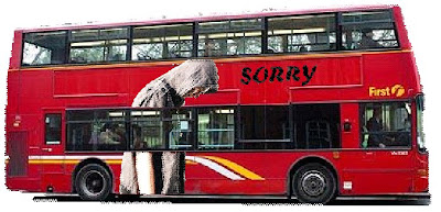
The image of the bus was taken from:
http://i.telegraph.co.uk/telegraph/multimedia/archive/01215/double-decker_1215733c.jpg

The image of the bus was taken from:
http://i.telegraph.co.uk/telegraph/multimedia/archive/01215/double-decker_1215733c.jpg


Problems with Adobe After Effects CS4
When editing out opening sequence, we decided to use After Effects CS4 to add the title ‘sorry’. We found a tutorial on video co-pilot where you can make a title shatter into glass pieces (http://www.videocopilot.net/tutorial/shatterize/). When we first started making the title we weren’t sure how to use everything so at the beginning it took a lot of attempts just to put two layers together. Another problem we had was the title that we used, uses a lighting effect which comes in a package which can be bought off of the website itself. But unfortunately we couldn’t pay for the software, so we had to make the title without this effect.
Tuesday, 8 February 2011
Facebook Page
http://www.facebook.com/pages/Red-Onions-Media-Independant-Film-Company/128893793846274
I decided to make a facebook page for our film company, the reason for this is due to the high amount of convergence and synergy, including how technology has evolved i decided this would help promote our film as well as advertise it around.
I decided to make a facebook page for our film company, the reason for this is due to the high amount of convergence and synergy, including how technology has evolved i decided this would help promote our film as well as advertise it around.
Thursday, 3 February 2011
T-Shirt idea simple.
Below is a simplistic idea for a t-shirt i made. I think this idea would market well due to the various and changing fashions this is quite stable; it is simple and does not make a cultural stand for anything, it does not scream a genre defining statement neither does it say nothing.


Monday, 24 January 2011
Poster Ideas
Below are 2 images i created using fireworks that are possible poster ideas.
Idea 1:

This is my first poster idea, i think although it is basic it dosent give much away which would be good for advertising the film due to it sparking curiosity. The basic colour theme help encourage the film, this is the general theme for products and marketing for us.
Idea 2:

This poster shows alot of similarity to my first one, although this would be a poster that would come out just after release, it shows 2 people walking which is part of the main plot line; we do not want to give that much away early.
Monday, 17 January 2011
Research into advertisements
Companies use advertising to promote the companies products. Advertising is mainly used to increase the sales of the products/ services, to create and maintain a brand identity or brand image, to communicate a change in the existing product line, to introduce a new product or service, and to increase the buzz-value of the brand or the company.
There are several different ways to promote films through different medium:
Some of the most effective forms of Commercial advertising I found were:
Wall painting, billboards, printed flyers, radio, web banners, mobile telephone screens, web popups, bus stop benches, magazines, newspapers, sides of buses, subway platforms and trains, posters.
Some of the most effective forms of Digital Advertising I found were:
Radio advertisements, contextual ads such as search engine results pages, banner ads, in text ads, social network advertisements, online classified advertisements, advertising networks and e-mail marketing.

Research into magazine covers

Before designing our magazine cover featuring our film, I decided to have a look into existing film magazines. The first magazine which I found interesting was one from ’Total Film’ magazines starring Johnny Depp; who plays one of the leading roles in the newly released film, Alice in Wonderland. The reason for this magazine being interesting to me is because of the bright colourful picture which grabs the viewer’s attention. The bright image contrasts the dark blue/purple and black background image making Johnny Depp drawer the most attention; attracting people to the magazine. The cover consists of a background image, a big photograph of the biggest star involved in the new film, bold fonts used for mast head, the banner headline and the giveaways. It also has a bar code, date of release, and information about other topics included inside the magazine. The font colours (white and yellow) stand out clearly which make them easy to read for any viewers. The target audience is aimed at young adults, movie lovers and adults. We can tell this because there are only a few images included which make them appeal to younger audiences such as young adults, although there is also a fair amount of text which appeals to the adults. If the magazine consisted of only photographs and no text, then it would be targeting children only, also if it only had text then it would appeal to older generations.

I have looked at another magazine released recently from ‘Total Film’. We can automatically see that the company are well known and confident enough to only show parts of their company name as they know that buyers will recognise them. The front cover sticks to a blue/green/ black colour scheme. Although these colours are usually quite dull they have managed to make it look bright and colourful by adding bright white head lights onto the image of the car. The featured film’s name ‘The Green Hornet’ has been made to stand out by the green bold font and capital letters. They have decided to use green because it relates to the name of the film. The magazine also has images of unreleased films to interest the readers, and also give them a preview into what films will be coming out soon. These film names are placed onto a red background to highlight them on the blue image behind. This makes them stand out clearly on the page; drawing the reader in. Again there is a bar code and the date that the magazine was released.
Following these designs, they show key elements which are required to make a magazine look interesting and professional. It needs to have bright big titles for the magazine name and we need a quick and simple company name which is easy for consumers to remember and read. There needs to be a brightly coloured photograph showing an interesting shot from the film which also gives a hint about the plot of the film. However, we cannot have too many images on the page to make it look over crowded and appeal to the wrong audience type. There also needs to be information to do with other interesting, well known films which are being released in the future to interest the readers. We also need to stick to a suitable colour scheme which isn’t too boring or too overpowering, and also appeal more to one gender type as this would reduce sales.
Sunday, 16 January 2011
Music, the final pieces chosen.
We decided to use a track from 'Film noodlings' by stephen scott, and 'Happy town' by 'Outrageous Flesh'.
We chose when the Film noodlings track because it goes nicely with the opening scene, it is slow, melodic and not too overpowering, which is ideal due to our quiet opening scene. We needed to induce emotion into the opening part, when Our character is writing, we needed to know it was a serious part of our opening scene, that it ideallised what the film was about and that it, although got attention, was not the focus of.
Happytown was chosen due to its contrasting sound in comparison. It is a happier, lyrical more jumpy kind of acoustic track, lyrically it is talking about a 'happy town', which goes nicely with london and also on the part where a bystander shouts "OI" after our character takes his paper the lyrics say "we kick and we scream" which i felt worked very nicely and also had a comedic effect to it.
editing: what we did
When it came to editing we only really had two choices in programs to use, windows movie maker and adobe premiere pro. windows movie maker is far to simplistic and we had better software to use so we thought it was best to make the most of it. We had few problems with premiere pro even though we had never used it. We used online tutorials to find out how to make a picture in picture shot and other things. When all the shots were cut we added effects with lots of fade to black transitions thinking it would work with our film and keep it eerie. Then music and the voice over was added. this was key as the camera had a lot of 'fuzzing sound' so doing this last over threw this and made the film more interesting, also set the mood better .
.

our editing is quite simple compared with some TV dramas and fims (as we had to cut shots down because of people waving) but still creates an atmosphere. Some things like the splitscreen looks like a trailler but still works well as and opening scene as it instantly tells the audience that those two people know somthing and keeps them griped. We also put the music to what was seen on screen like witht he double beat in the letter and lyrics of song going with actors walking thorugh london.

our editing is quite simple compared with some TV dramas and fims (as we had to cut shots down because of people waving) but still creates an atmosphere. Some things like the splitscreen looks like a trailler but still works well as and opening scene as it instantly tells the audience that those two people know somthing and keeps them griped. We also put the music to what was seen on screen like witht he double beat in the letter and lyrics of song going with actors walking thorugh london.
Saturday, 15 January 2011
Rough Cut Feedback
Audience feedback after Rough cut.
Following the rough cut we decided it would be best as a group if we asked people for their responses towards the film and what they liked or didn’t like about it so far and most importantly what could be improved.
We designed 5 key questions we wanted the audience to answer after watching the rough cut, they were designed to help us the most regarding the positives and negatives of the film and suggested improvements. The first question we was going to ask was the person’s overall opinion of the opening sequence, this was going to straight away tell us if our target audience thinks that our idea works well or doesn’t. The second question we asked was ‘What parts did you enjoy?’ this again is only for our benefit and a way in which we can work out what our audience enjoyed so far. The third question is the most important question overall because it is asking for any suggestions as to how we could improve the opening sequence, this will become very useful information when piecing together the final cut. The penultimate question was asking if the the film engaged the audience; this will determine if our film is gripping like Hollywood block busters or not. Finally the last question asked ‘In its current state would you pay to watch the film?’ again this is very important because if people do not want to see our film then it cannot be that good.
All these questions were asked to different age groups and different genders. Below are some of the most useful responses we got for each question as well as a summery paragraph that we will be able to look back on when coming to the final cut.
What was your overall opinion from the rough cut?
I thought the idea of the film and shots were good, however I didn’t really know what was going on. The first minute was slow going but with narration, it will clearly be more interesting. (Dylan Meade aged 16)
I thought it had good parts and some parts that could be improved on, but overall I thought that it had a wide variety of interesting shots used. (Chloe Tetu aged 16)
What parts did you enjoy?
I enjoyed the scene where the protagonist walks through the streets of London and snatches a newspaper. An effective close up was used in this scene. (Alex Barham aged 16)
I liked the use of transitions and effects throughout the opening sequence. The slowed down footage emphasises the importance of some parts of the film and this made me want to continue watching. (Nathan Whitcomb aged 20)
What do you think we could do to improve the film?
At the moment the film is slow paced and takes a while to get going, make some shots shorter and add sound. (Chris Andrews aged 22)
There are no titles in the opening sequence and without them it looks very amateurish. (Ryan Malster aged 18)
Did the film engage you and draw you in?
It did at some parts however during the slow parts it was rather boring. (Nathan Whitcomb aged 20)
Yes I really enjoyed it and I thought that it was really interesting. (James Kerr aged 14)
In its current state would you pay to watch the film?
No. (Dylan Meade aged 16)
Yes I thought it was well put together. (Louis Kersey aged 14)
Using the information we collected we are going to go back to the editing stage and change the errors that we raised by our audience. As well as this we are also going to finish the sound and titles and add them in to make the opening sequence look professional.
Friday, 14 January 2011
Rough Cut
Here is our opening scene rough cut. When uploading it to Youtube, our clip has been changed when we edited some shots to be in slow motion which has made it become very jolty.(when turning the sheet of paper over)
Saturday, 8 January 2011
The filming schedule
Day 1 of filming: Monday 23rd November 2010
• Meet outside Wickford station around 10:00am
• Arrive at London Liverpool street around 10:45am
• From London Liverpool street take the underground circle line to Westminster
• Here we will film part of our opening sequence and look for an establishing shot that we can safely get.
Day 2 of filming: Wednesday 1st December 2010
• Cancelled due to heavy snow fall
Day 3 of filming: Tuesday 7th December 2010
• Film the letter scene
Day 4 of filming: Saturday 11th December 2010
• Film the establishing shots and the title sequence
Day 5 of filming: Monday 3rd January 2011
• Film the title sequence again
Friday, 7 January 2011
Newspaper article.
Newspaper article.
Due to the newspaper shot in the film we decided to create an article that fitted the film and also tells part of the story line. The article explains who the main character is as well as the character that walks into him during the opening sequence. Below is the article that Alan Andrews wrote, having the article written we then had to make the article stand out with images and bold font. The article below is the final cut for the article:
Two convicts have recently escaped from Creston prison earlier this morning, they are considered to be highly dangerous and to be evaded at all costs. The convicts go by the names of Lance Shives and Darren Autin although the likelihood is that other Alias’ are being used, after recently being prosecuted for the murders of eight young school students earlier this year the criminals have been heavily in the press all over Europe for the sick crime they committed. We are asking anyone with information on this matter to come forward, anonymity is welcomed and all information will be confidential. The controversial theories about their affiliation with media reporter Robert Krendon has been laid to rest today after a warrant search on his apartment ended empty handed, he is now in protective custody. Armed security has been deployed over all major airports and other links to outside the country.
If either of these criminals are seen do not approach, call 999 and ask for armed responses unit and state why.
Continued on page 4.
Accompanied with images of the characters the article explains a brief period before the film, although the audience won’t be able to read the whole article within the shot. They will none the less be able to read the mast head and also see the images, and by putting the two things together they will be able to make out that the article was written about the main characters.
Main characters clothing: worn.
Main characters clothing on.
We also photographed the clothing being worn just to show the effectiveness of the clothes and the difference between the two outfits.
The first outfit is photographed below; the image on the left shows the outfit from a distance while the image on the right focuses more on the detail. The clothes are effective because we wanted to add a sense of mystery into the opening sequence and by blocking the characters face from the audience it adds that mystery in really well. The way the audience can only see part of the characters face is done effectively due to the hoodies that are being worn, they block of a large proportion of the face.


The second outfit is photographed below in the same way; the images are photographed in the same way but with the second outfit on. The outfits also work really well with the image we are portraying to our audience and it is exactly what we wanted to do when we planned the opening sequence.


Main characters clothing: laid out.
The main characters clothing laid out.
We aimed to get across to the audience that our main character was on his own and somewhat like an outcast of society. We did this through the clothing and the way he wore the clothing. The character wears very ‘thuggish’ clothing as well as this he walks and holds himself in that way to and it shows when watching the opening sequence.
The main character wears two different costumes in the opening sequence. The first when he is writing the letter and the second when walking the streets of London. We changed the clothes so the audience could tell that the two separate events are not happening on the same day and there is in fact a time scale between them.
Below is the first outfit: The image on the left shows the clothes lay out across the table in a way that you can see head to toe. This outfit is made up of a pair of jeans; t-shirt; jumper and a coat. The outfit works very well because in the scene when it is worn both of the hoodies are up. The image in the middle shows a close up of where the characters head would be, it shows the different layers of clothing as well as the two important hoodies. The image on the right shows the bottom of the coat and the top of the jeans, it is just an image to show the clothing matched and worked well together.


Below is the second outfit we choose: like the first we have gone for the same look but instead of jeans we opted for track suit bottoms. Just like the above images the photographs are taken in the same position to show the different clothes and the different layers.


The music we chose.
Music:
After looking through various genres of music we eventually decided to use music created by a friend; Stephen Scott and his sub projects: 'Film Noodlings', 'Happytown' and 'hey hey, we're the misfits' We have the following tracks;
(although no specific track titles are had when we choose the final piece for the film more specific information will be added under "final music analysis")
Track 1
Outrageous flesh
Happytown
Track 2, Track 5, Track 13
Stephen Scott
Film Noodlings
Track 3
Outrageous flesh
Hey hey, we're the misfits.
Track 1, Track 3;
We though this would be a good piece of music for the walking scene due to its passive, walking nature and it keeps a casual happy feeling towards it.
Track 5, Track 13, Track 2; We feel these all work well with the opening scene in which the main character is writing, we feel they give a spacious mellow feel to them which is the atmosphere we need to try and give.
Thursday, 6 January 2011
Props in more detail
Wooden chair

We decided to use a wooden chair as one of our props as during filming the character was sitting at a desk in his bedroom, so we felt that a wooden chair would go quite well with the location.
Wooden table

We chose to have a wooden table situated in the character’s bedroom where he was writing a letter in our opening sequence. We thought that the wooden table went quite well with the location used.
Lined paper

We used lined paper as a prop in the opening sequence. This was used to make scrunched up balls to show that the character has written several letters wrong and then thrown them on the desk. We also used it when the character is writing his final letter.
Black pen

We used a thick black pen when the character is writing the letter. We chose to use this type of pen instead of a normal biro as it stood out, and was easy to read when filming.
Watch

The character was wearing a silver watch throughout the whole opening sequence to hint at the point that time was a significant feature. We used a silver watch to stand out on his wrist and to also look expensive, which implied that our character is quite wealthy.
Alarm clock

We used a red led digital alarm clock at the beginning of our opening sequence. This is because we wanted to elaborate that time was an importance to the character. We chose to use a red led display because it was easy to read when filming and stood out throughout all of our shots.
Desk Lamp

We chose to use a black desk lamp which was quite bright to give a direct light onto the letter that the character was writing. We chose to have a black lamp because it didn’t stand out in the dark room; all you could see was a strobe of light on the paper.
Merchandise collage with analysis

Analysis of merchandise poster:
The poster I have done above is a collage of various merchandising material used that have given us idea for merchandise we could sell and market for our film. Ideas such as T-shirts and posters are able to be done, and we intend to use these ideas and develop them further.
We feel merchandise is crucial in our film as we can sell things to any fans we may have as well as having an almost interactive way of advertising our film. The merchandising will be for audiences of all ages and economically will not cost too much to produce making this overall a cost effective idea with a greater outcome.
By using the poster it will also invite us to explore more various and diverse ideas allowing us to have a wider marketing range and have more products that will ultimately appeal to more ages and people.
casting
We used Alan and Eden as the main characters in our film as they where easy to get, as they were already involved with the film. This meant we didn’t have to explain the idea of the film to people and we had less people to arrange some time when everyone was free and there was still daylight. A downside to this was that they are not the best actors and there was no dialogue but we were hoping to get around this with a narration in the background. We didn’t have to get extras as general people walking around works OK. This also helped with peoples reactions as they might of looked weirdly at our actors and therefor helping the scene.
We thought this would be OK as long as we drooped in a big name actor/ actress. We found that from other thrillers such as paycheck and fight club that they leave the lead role to the less known actor ( in our case Eden and Alan) and have the support played by someone like Ben Affleck or Brad Pit. This gives the actors their opening 'break' and lets the institution know about new talent.
We thought this would be OK as long as we drooped in a big name actor/ actress. We found that from other thrillers such as paycheck and fight club that they leave the lead role to the less known actor ( in our case Eden and Alan) and have the support played by someone like Ben Affleck or Brad Pit. This gives the actors their opening 'break' and lets the institution know about new talent.
Wednesday, 5 January 2011
Monday, 3 January 2011
Final location Analysis
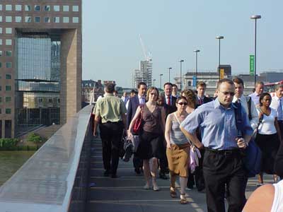
After assessing our various locations that we brainstormed (as posted) and researching into them we eventually came to the decision that london (more precisely westminster) was our best location for various reasons, which include;
Atmosphere:
The atmosphere of london is seemingly rushed but also passively friendly, and due to its various amount of events and attractions it would seemingly camouflauge anything unusual that we may be needing to do, which is appealing as it would not attract unwanted attention and not cause the surrounding people/objects etc to change accordingly.

Commuters;
Commuters help the atmosphere of london in its rushed pace by demonstrating it perfectly, they are rushed to get to where they need to be, they are normally smartly dressed also which is helpful due to a character shall be wearing a suit, but also london is full of casually dressed people which is good as two other characters in our film will be dressed casually, again helping camoflauge any seemingly 'odd' actions or clothing.

Landmarks;
London is riddled with world famous landmarks such as big ben, the london eye and westminster abbey, this is helpful as our film location will be recongized by a larger audience which will be able to empathise with our characters as most will know how londons atmosphere is and therefore can familiarise themselves with the locations.

Atmosphere:
The atmosphere of london is seemingly rushed but also passively friendly, and due to its various amount of events and attractions it would seemingly camouflauge anything unusual that we may be needing to do, which is appealing as it would not attract unwanted attention and not cause the surrounding people/objects etc to change accordingly.

Commuters;
Commuters help the atmosphere of london in its rushed pace by demonstrating it perfectly, they are rushed to get to where they need to be, they are normally smartly dressed also which is helpful due to a character shall be wearing a suit, but also london is full of casually dressed people which is good as two other characters in our film will be dressed casually, again helping camoflauge any seemingly 'odd' actions or clothing.
Landmarks;
London is riddled with world famous landmarks such as big ben, the london eye and westminster abbey, this is helpful as our film location will be recongized by a larger audience which will be able to empathise with our characters as most will know how londons atmosphere is and therefore can familiarise themselves with the locations.

Subscribe to:
Comments (Atom)